.png)
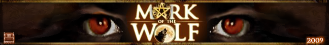
Here it is: The "official" logo to Mark of the Wolf".
I LOVE this logo.
It captures everything I wanted to see for this movie project. And best of all, it looks awesome.
Again, special thanks go out to my friend Bobby from Waveride for taking my sketch idea from long ago and making it look very very cool. He also did the logo for MarkOne Films as well.
So now, as we are about three weeks away from beginning production, you're going to see this logo everywhere, starting with the blog and then to the eventual website and hopefully the teaser trailer which I hope will be revealed by August.
That's it for now. I'll have another update tomorrow.
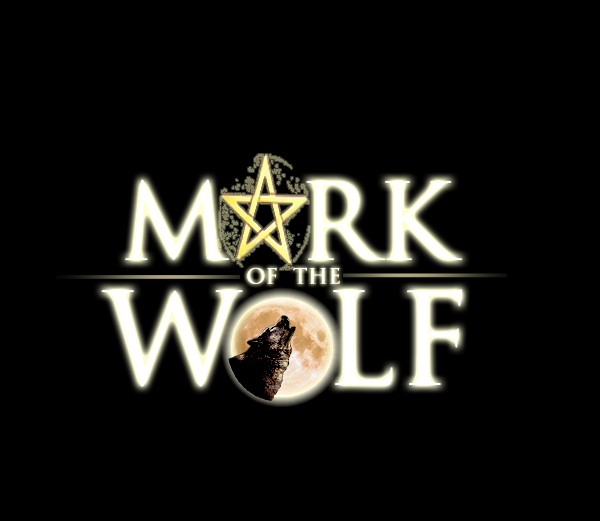
Oh by the way, here's how the MOTW logo looks in white. Which looks best to you?


1 comment:
I love both version of the MOTW logo! I think the one with the black background looks a little more "ominous" but the white one is nice too. Great job!
Post a Comment